Rebranding for “Fish Day” a series of TED-style events. The challenge is to keep the legacy of the original logo (also by me) but make it more impactful and energetic.

Task
Rebranding for “Fish Day” a series of TED-style events. The challenge is to keep the legacy of the original logo (also by me) but make it more impactful and energetic.
Solution
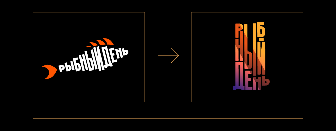
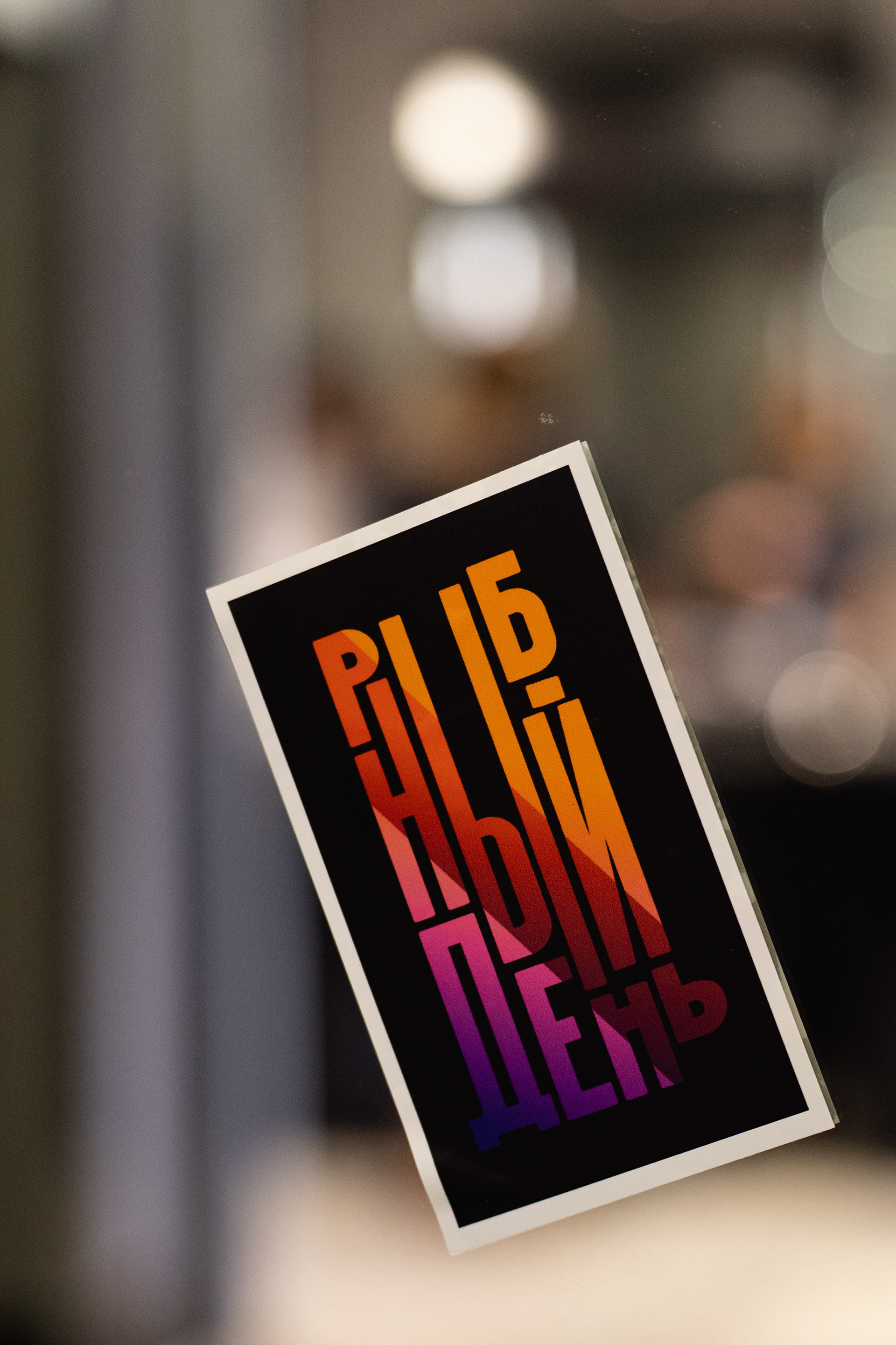
I kept the typeface from the previous version of the logo and rearranged the letters to create a new “fish” form. The bright gradient gives the sign more energy.
Main versions

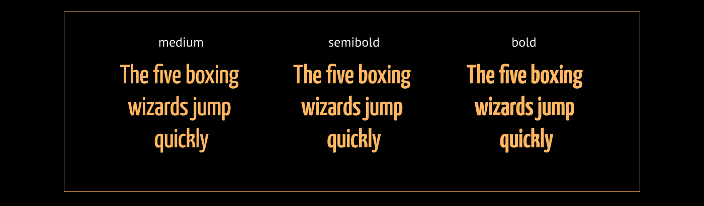
The Yanone Kaffeesatz typeface is used in three variants
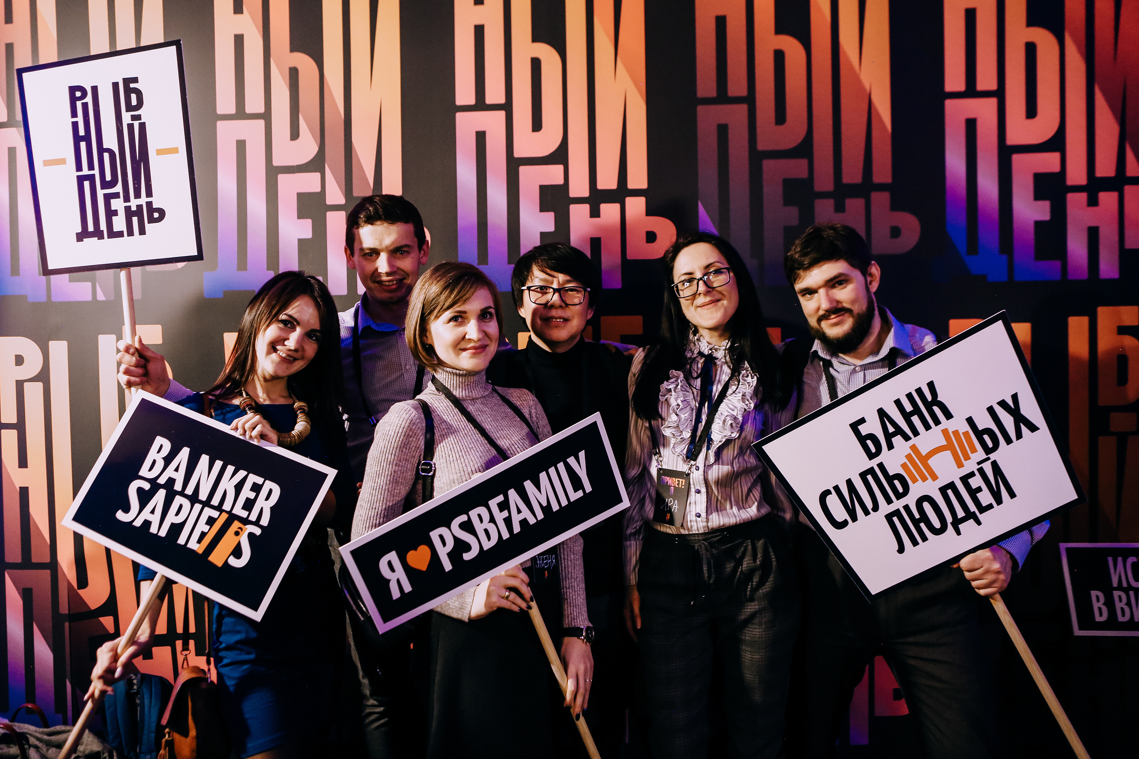
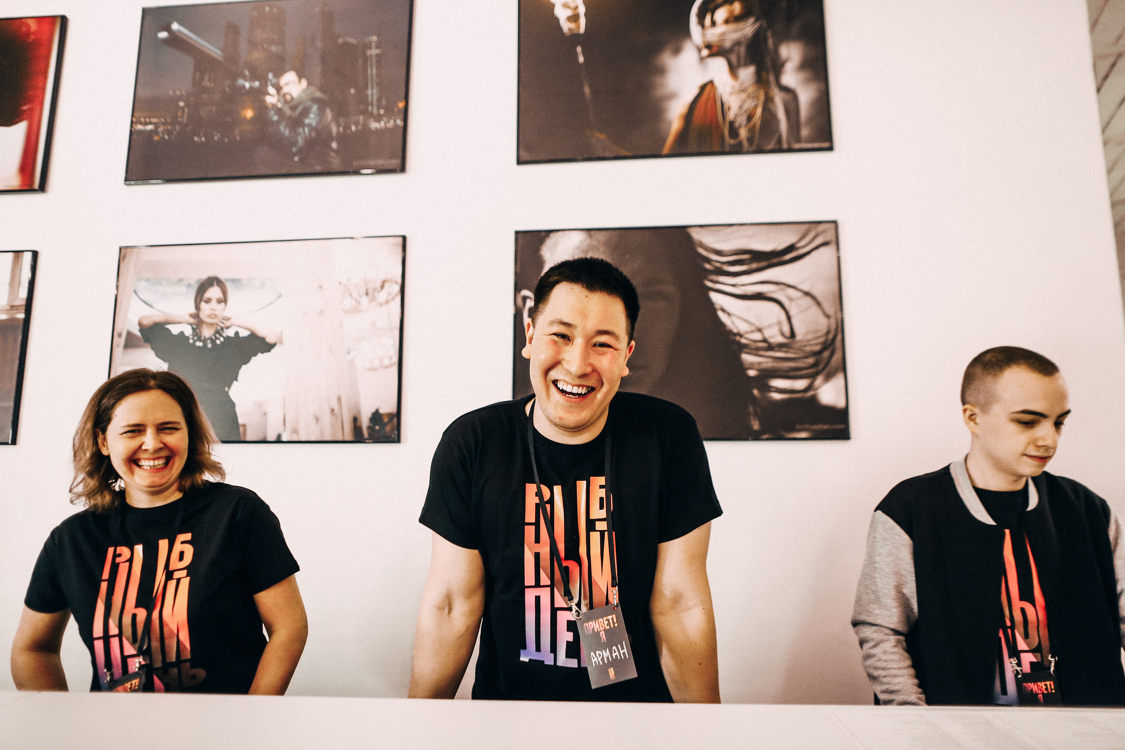
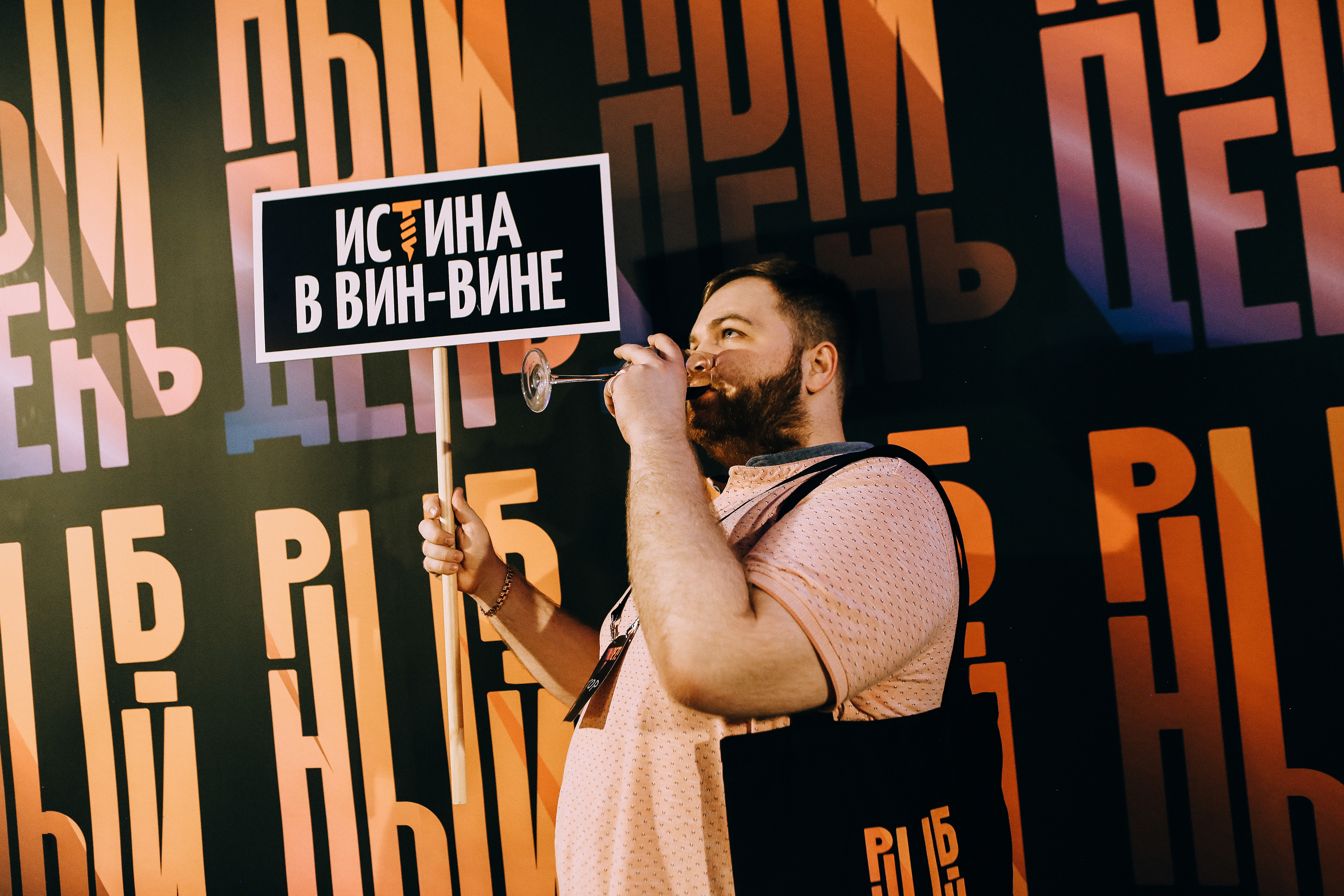
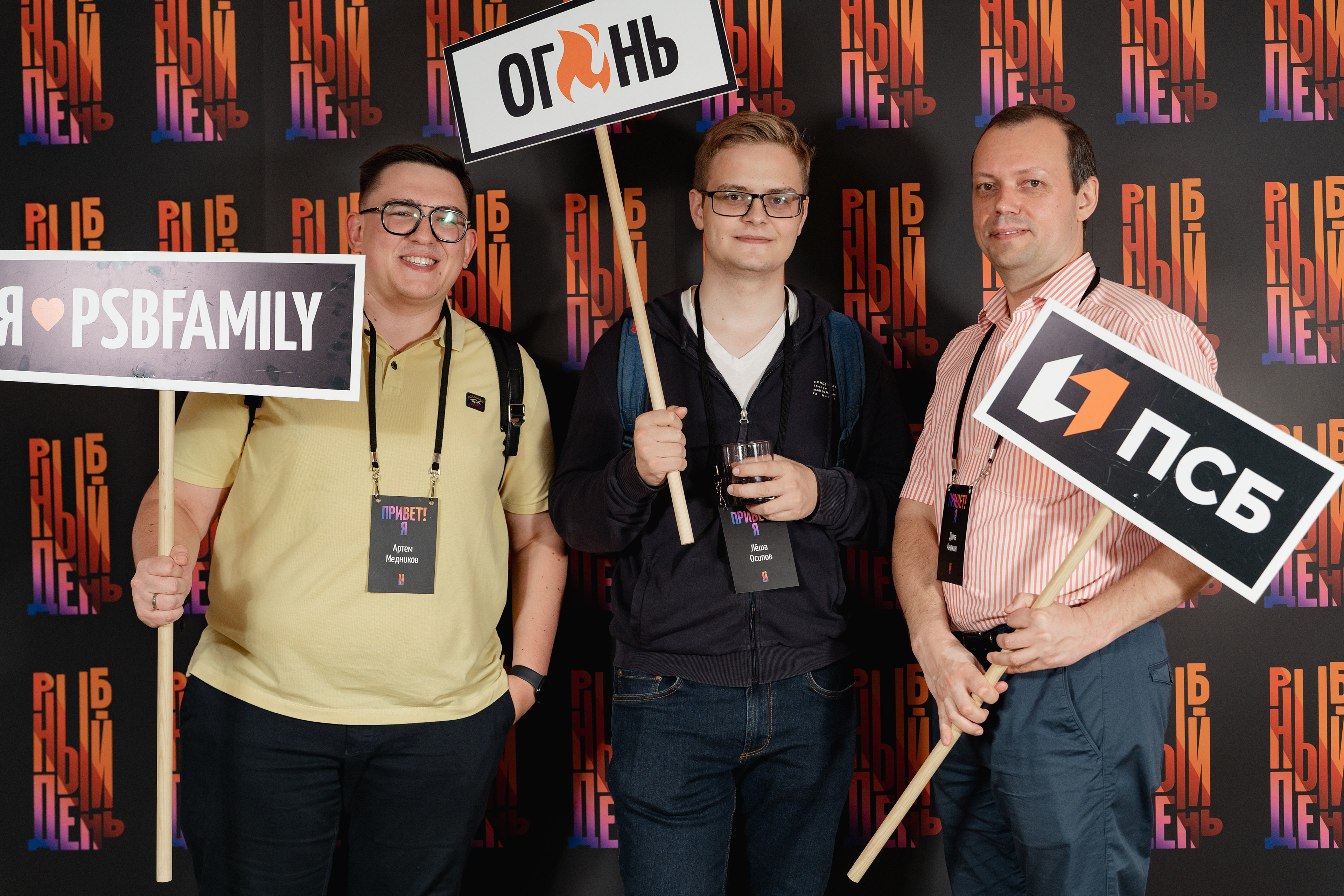
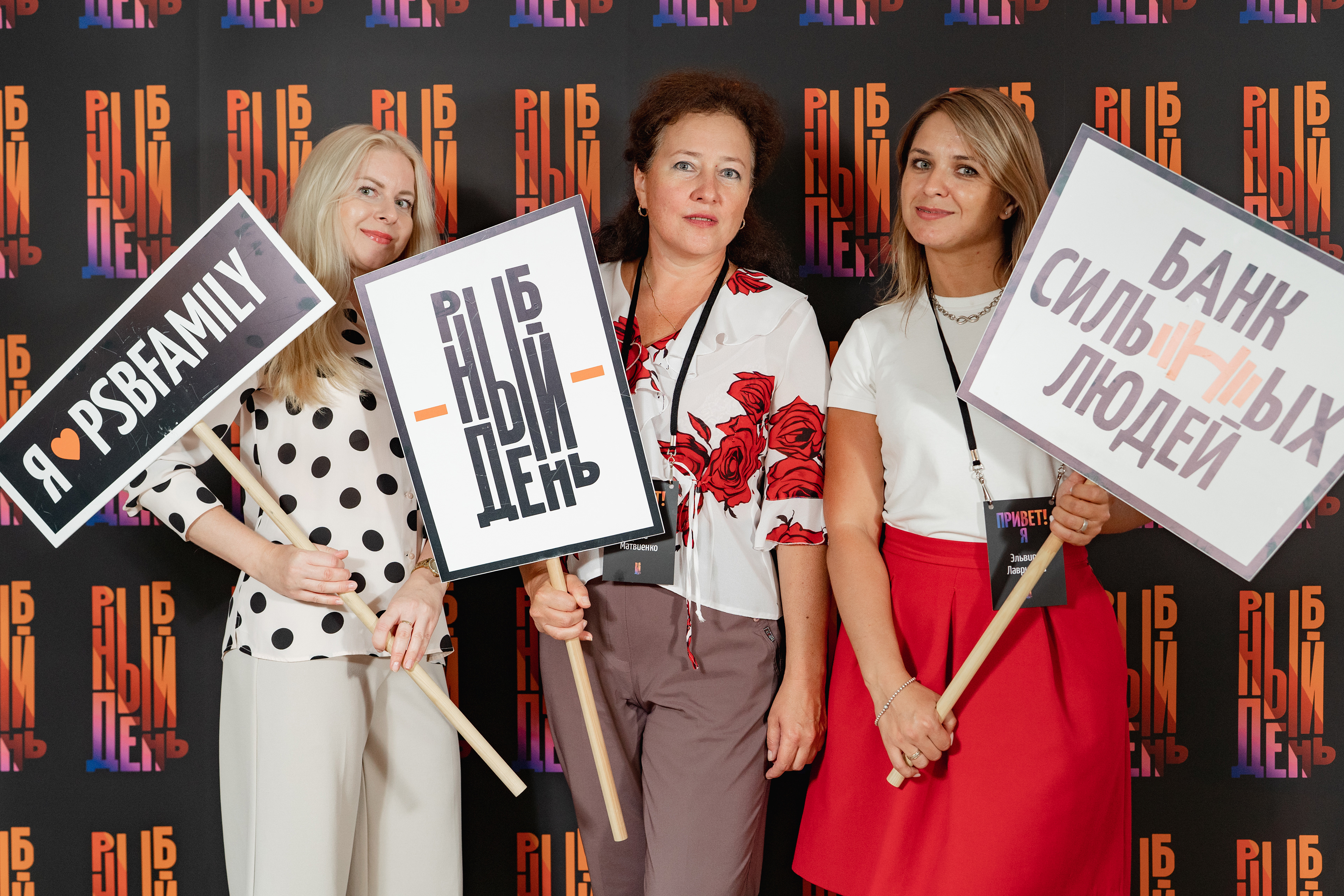
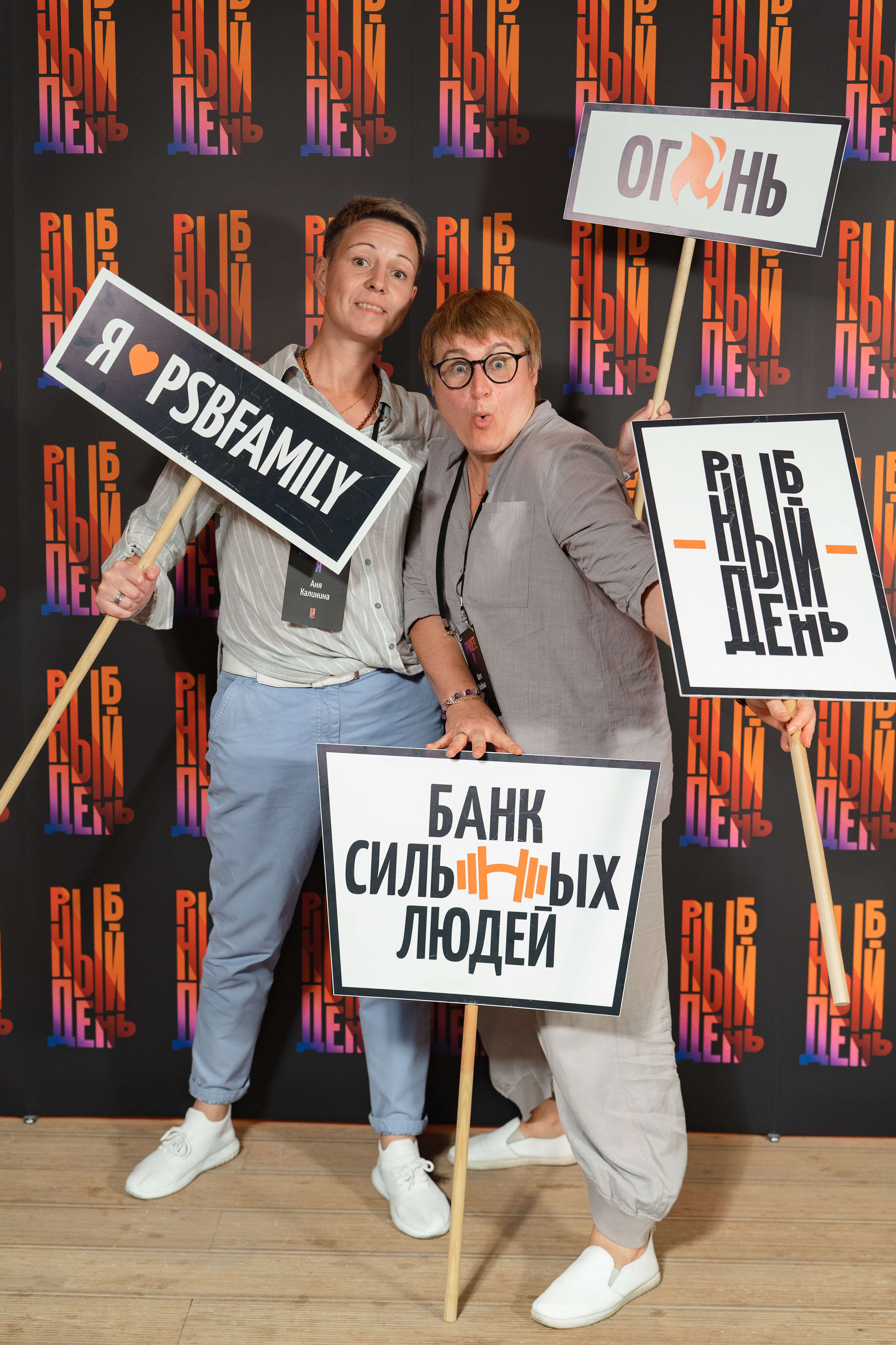
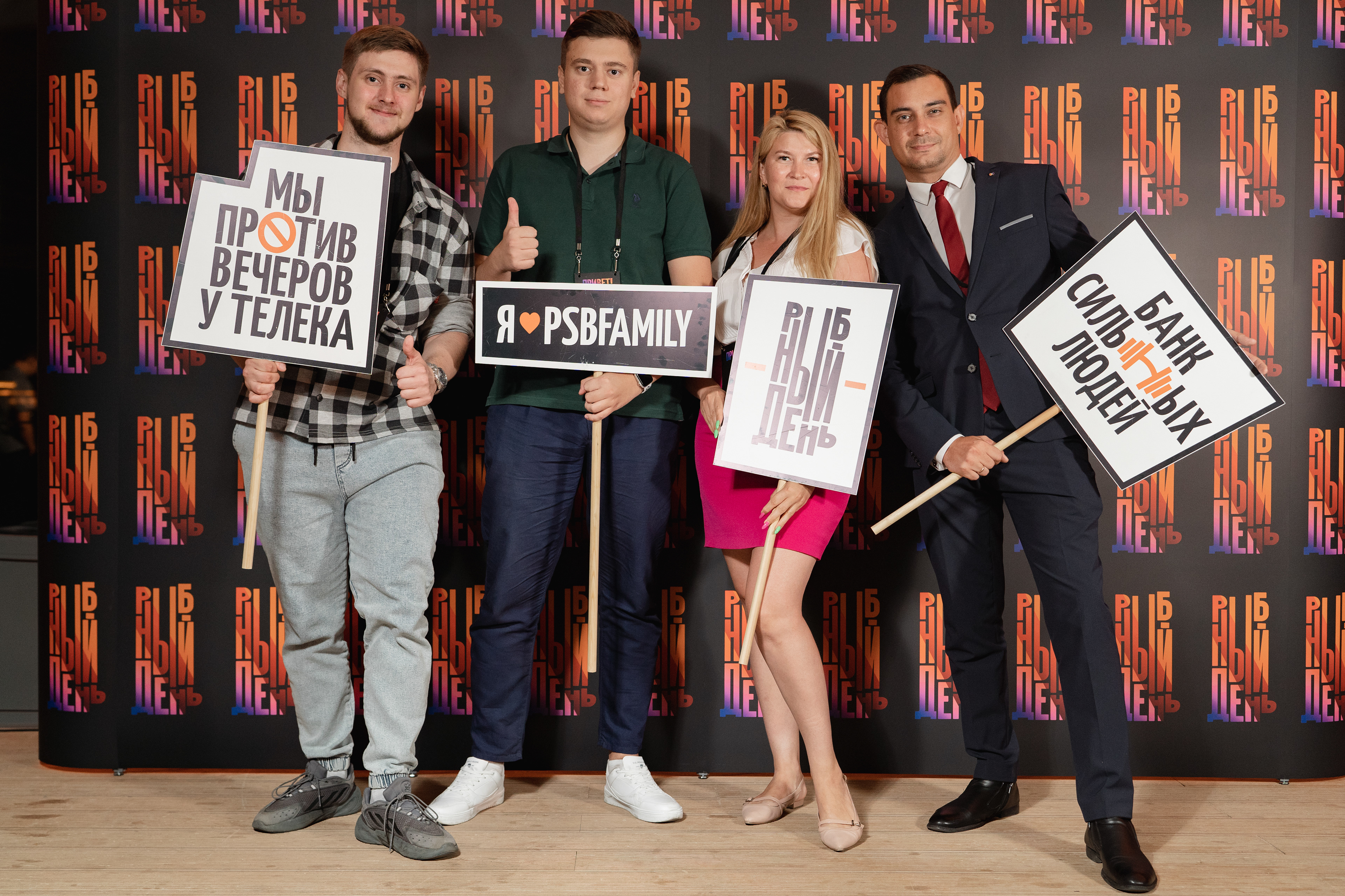
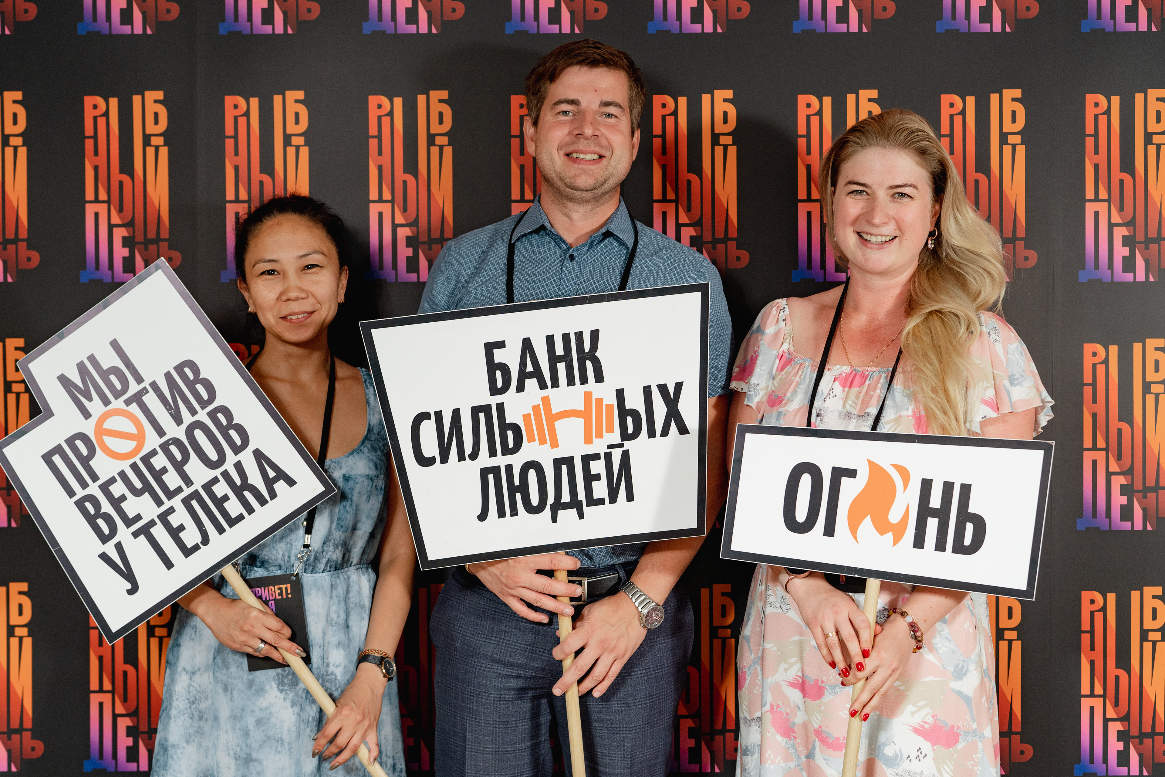
I designed speech bubbles for the photo booth


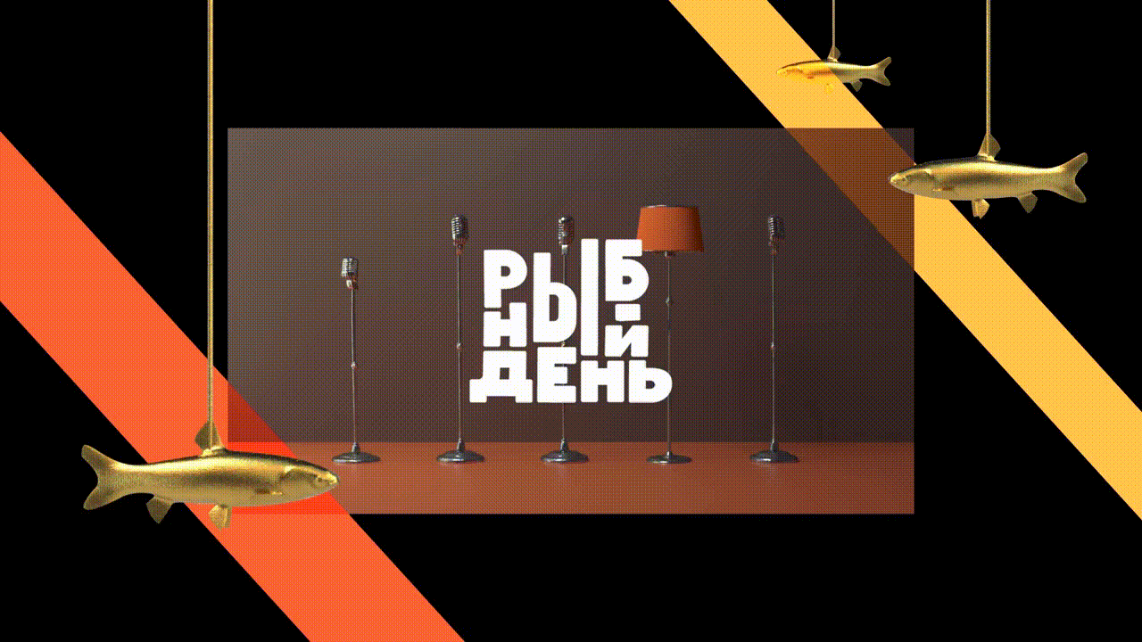
During the 2020 COVID-19 pandemic the event went online, and the visual identity was used in a video intro (by Zhi-Shi)
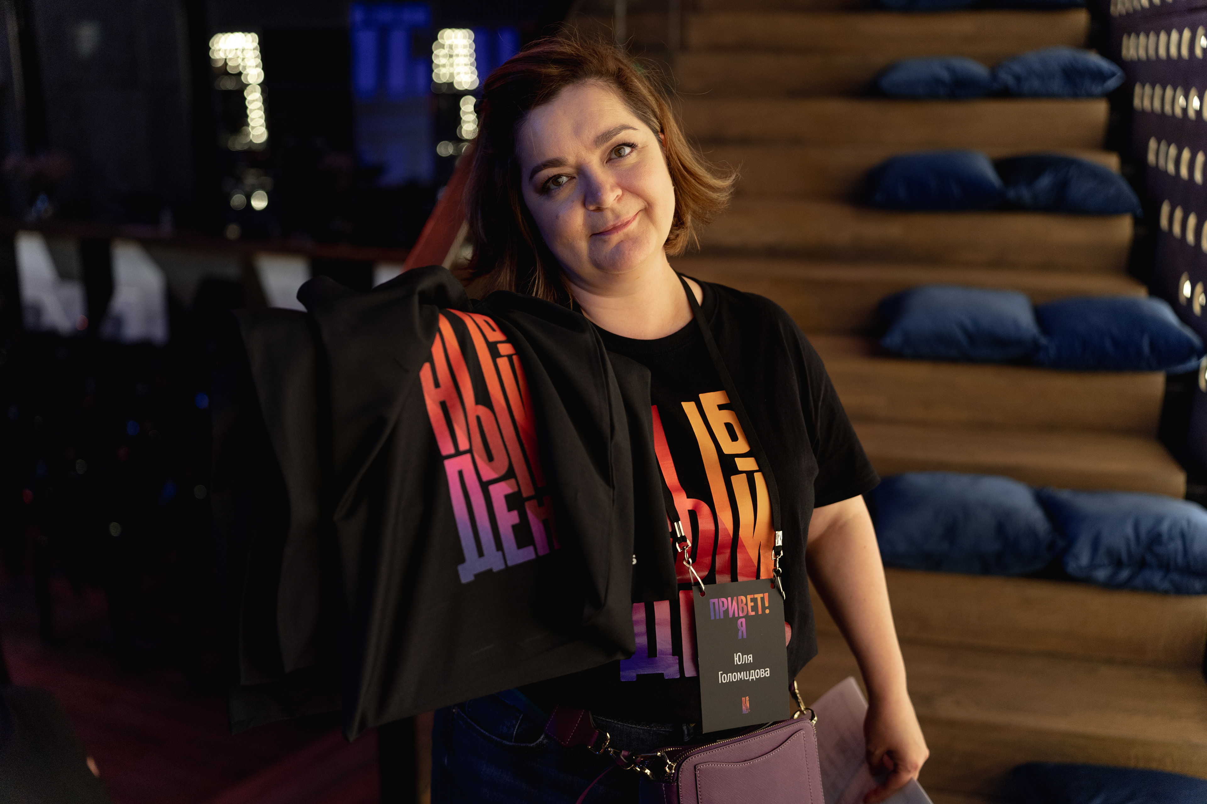
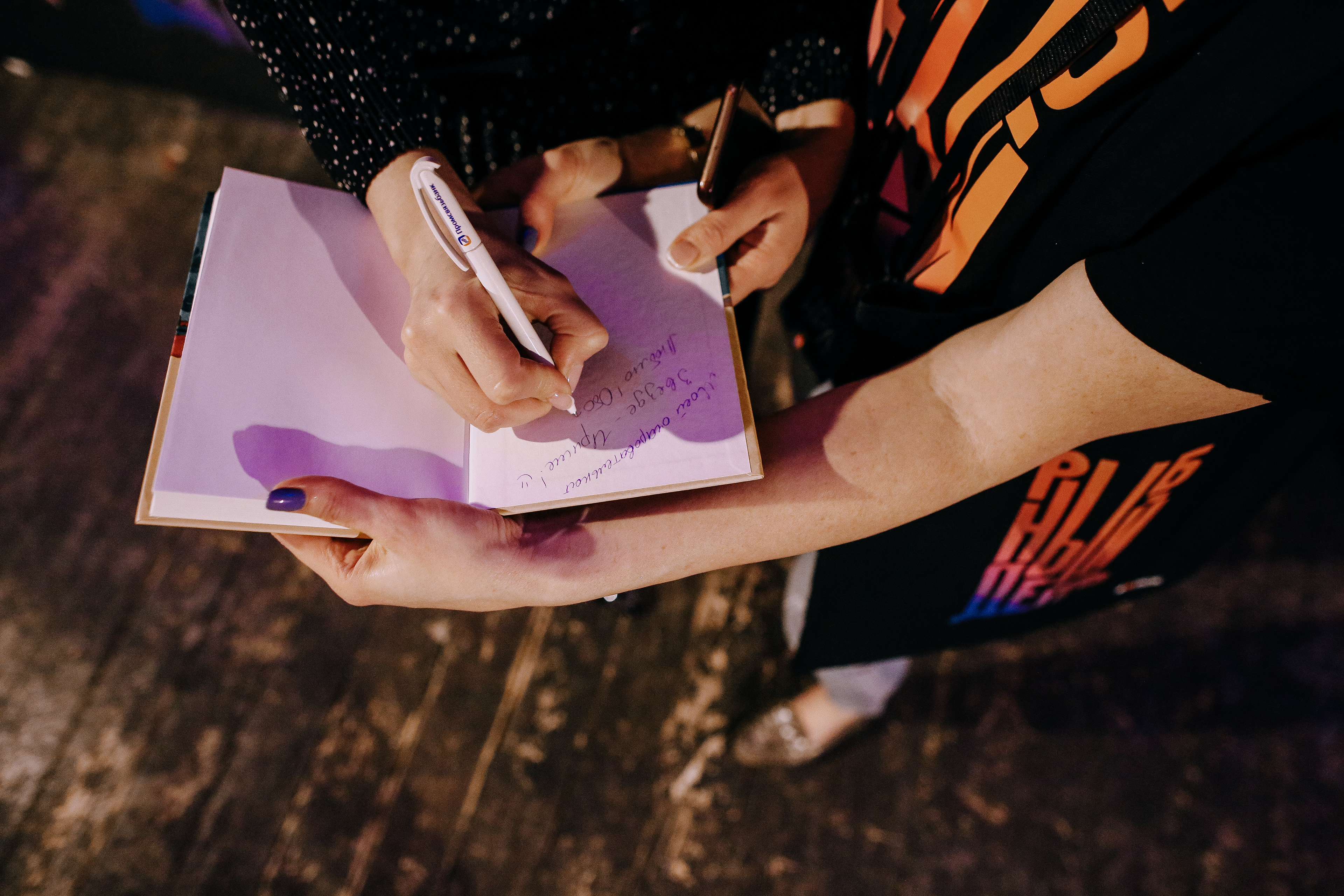
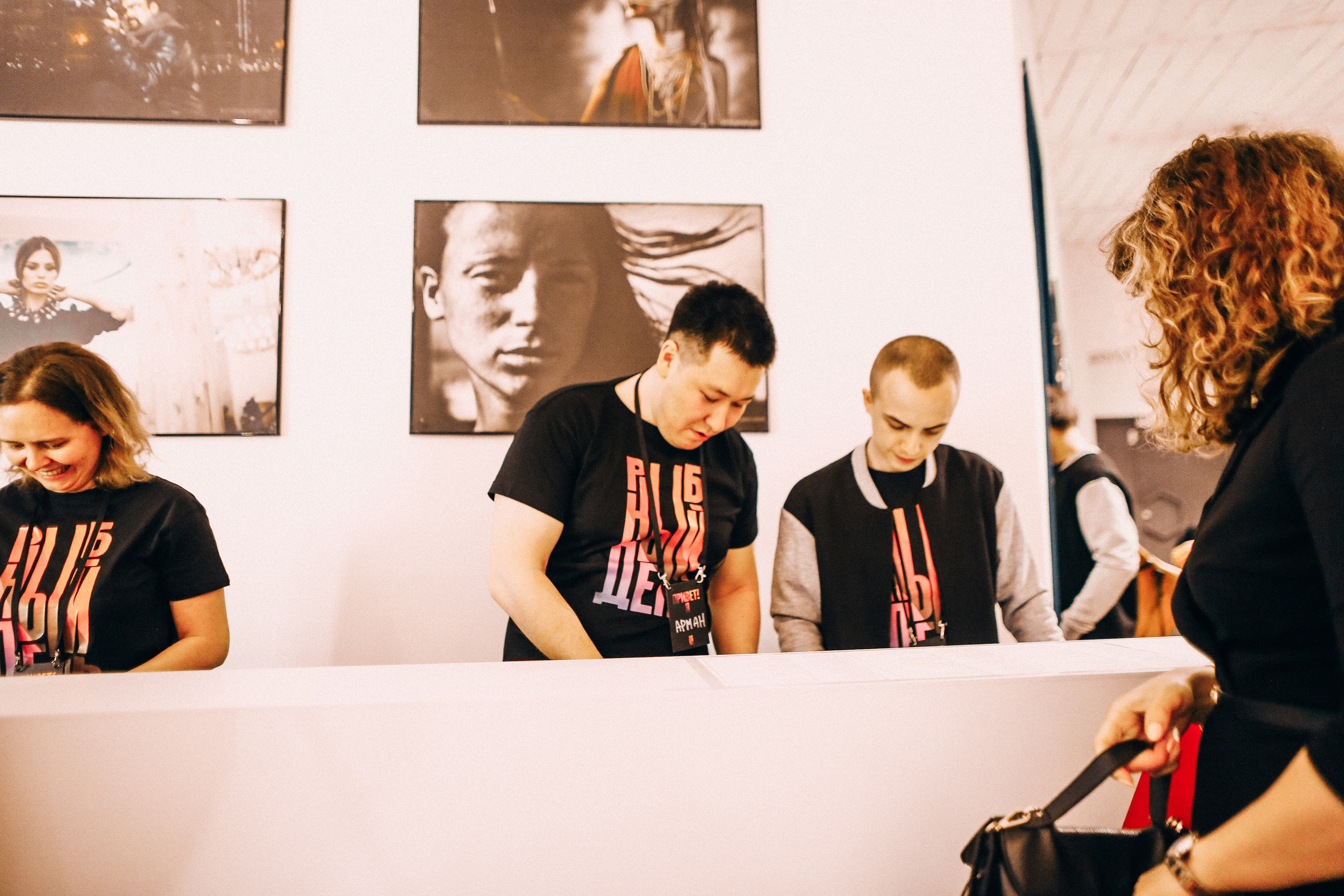
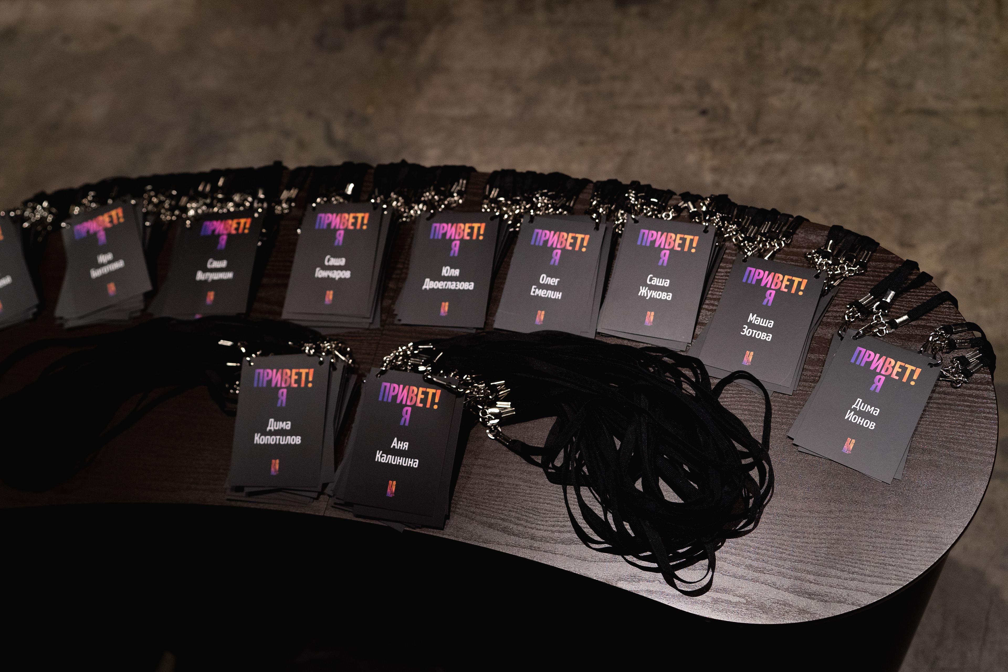
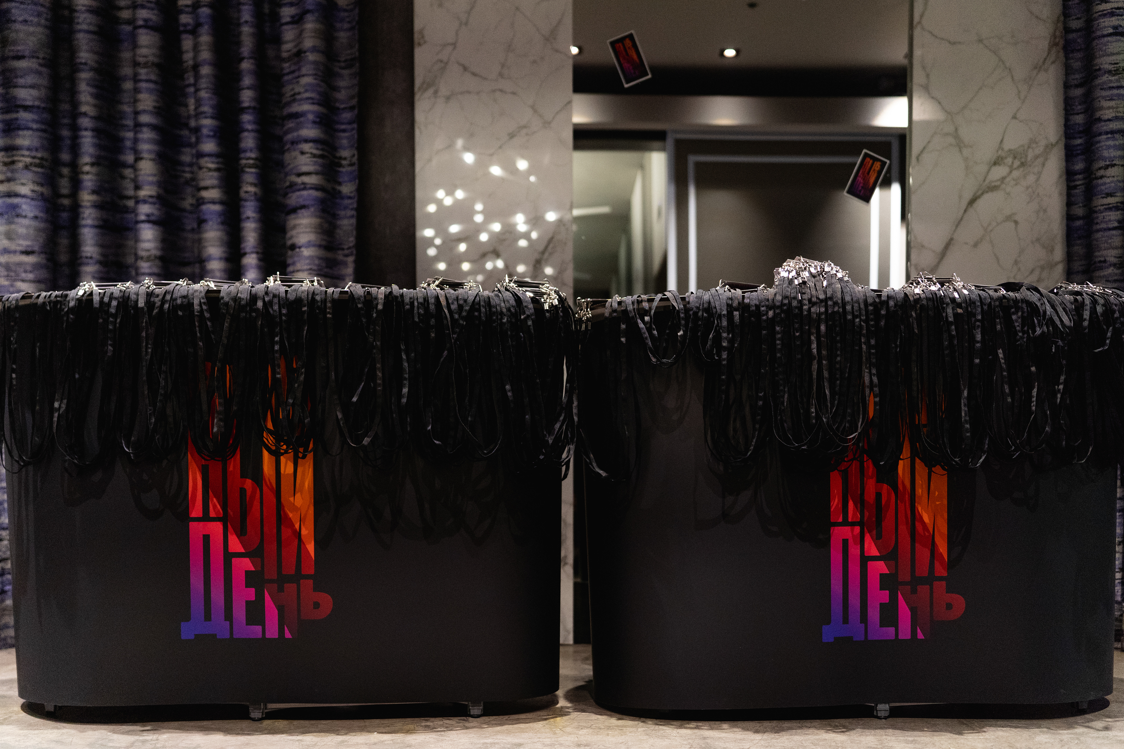
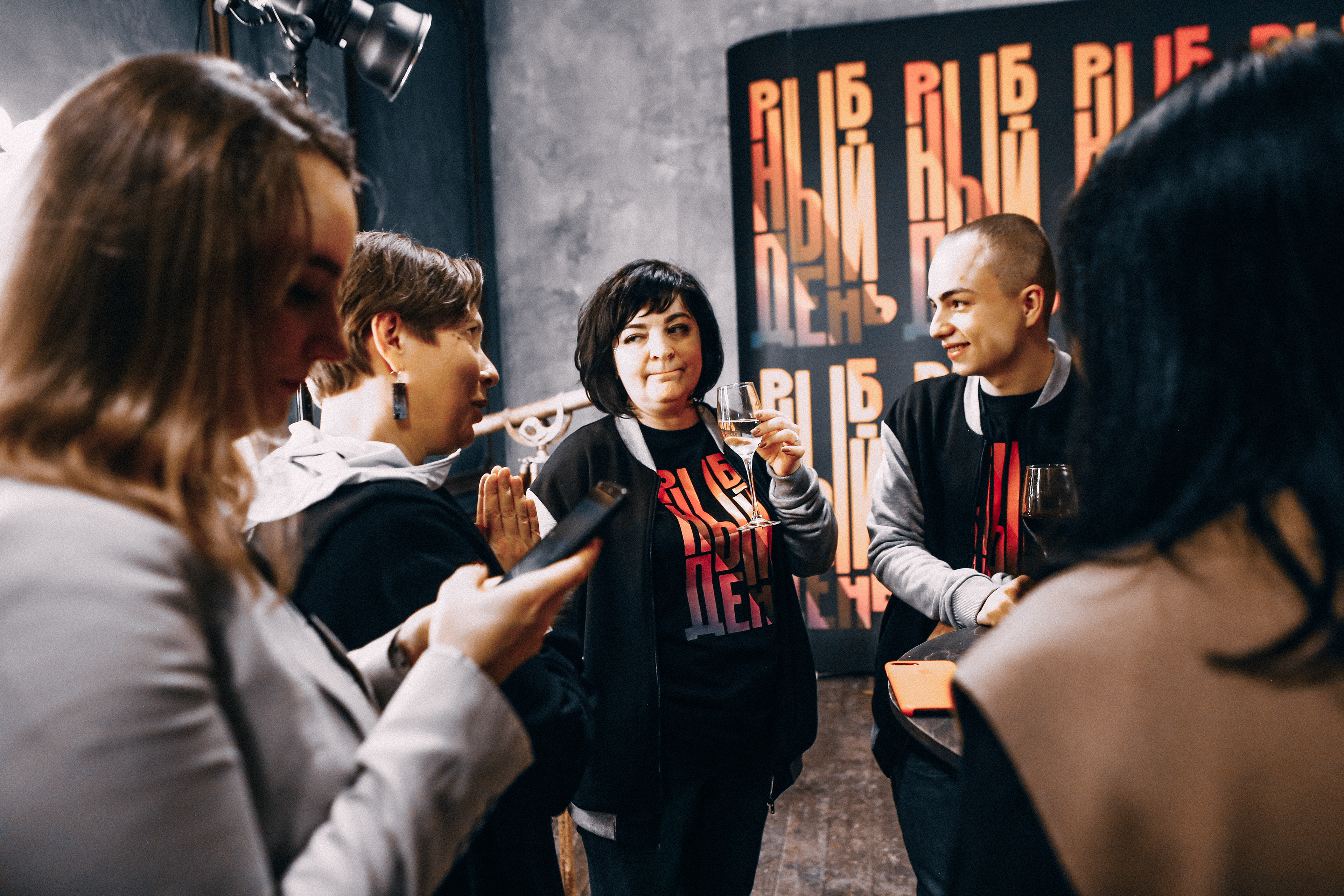
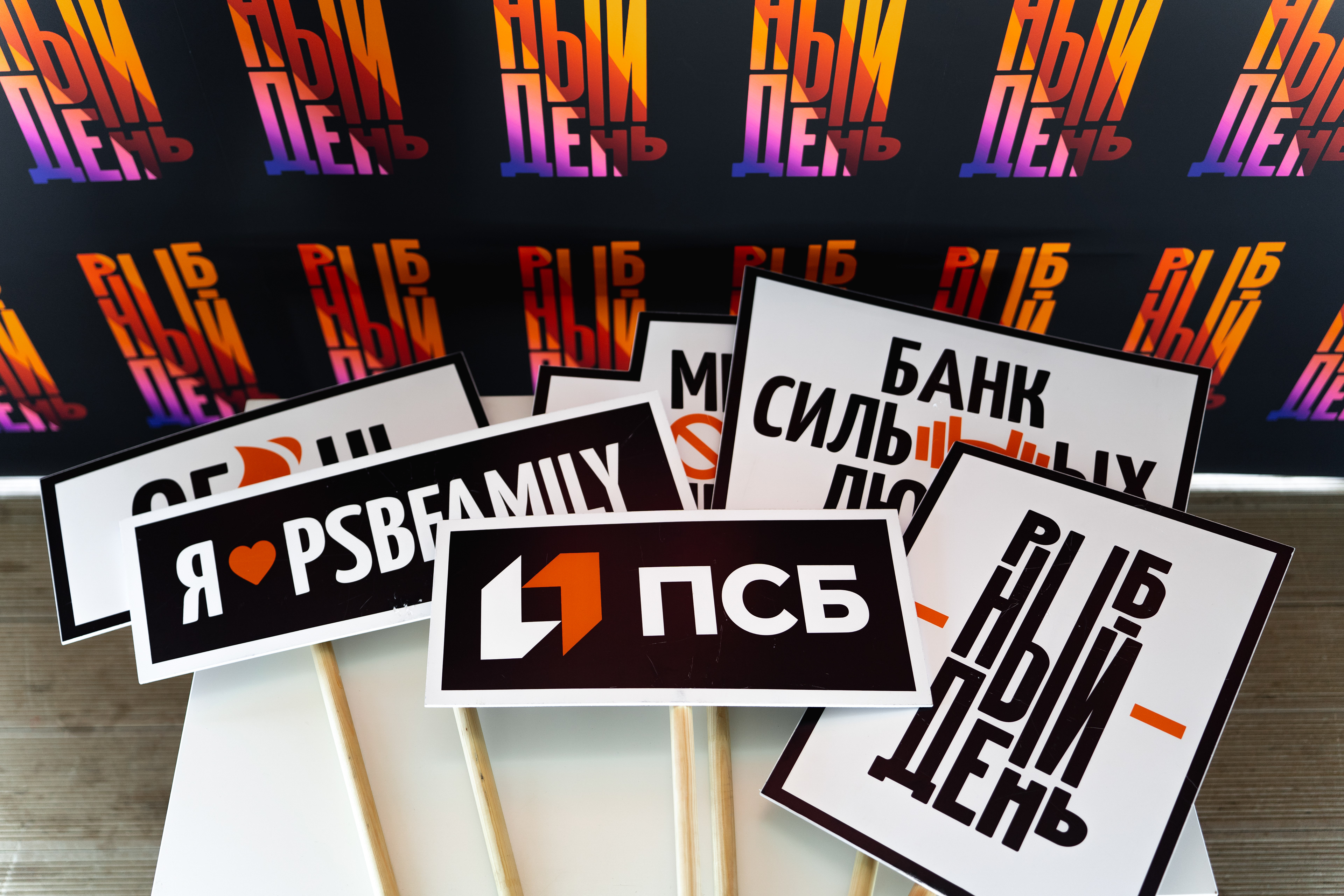
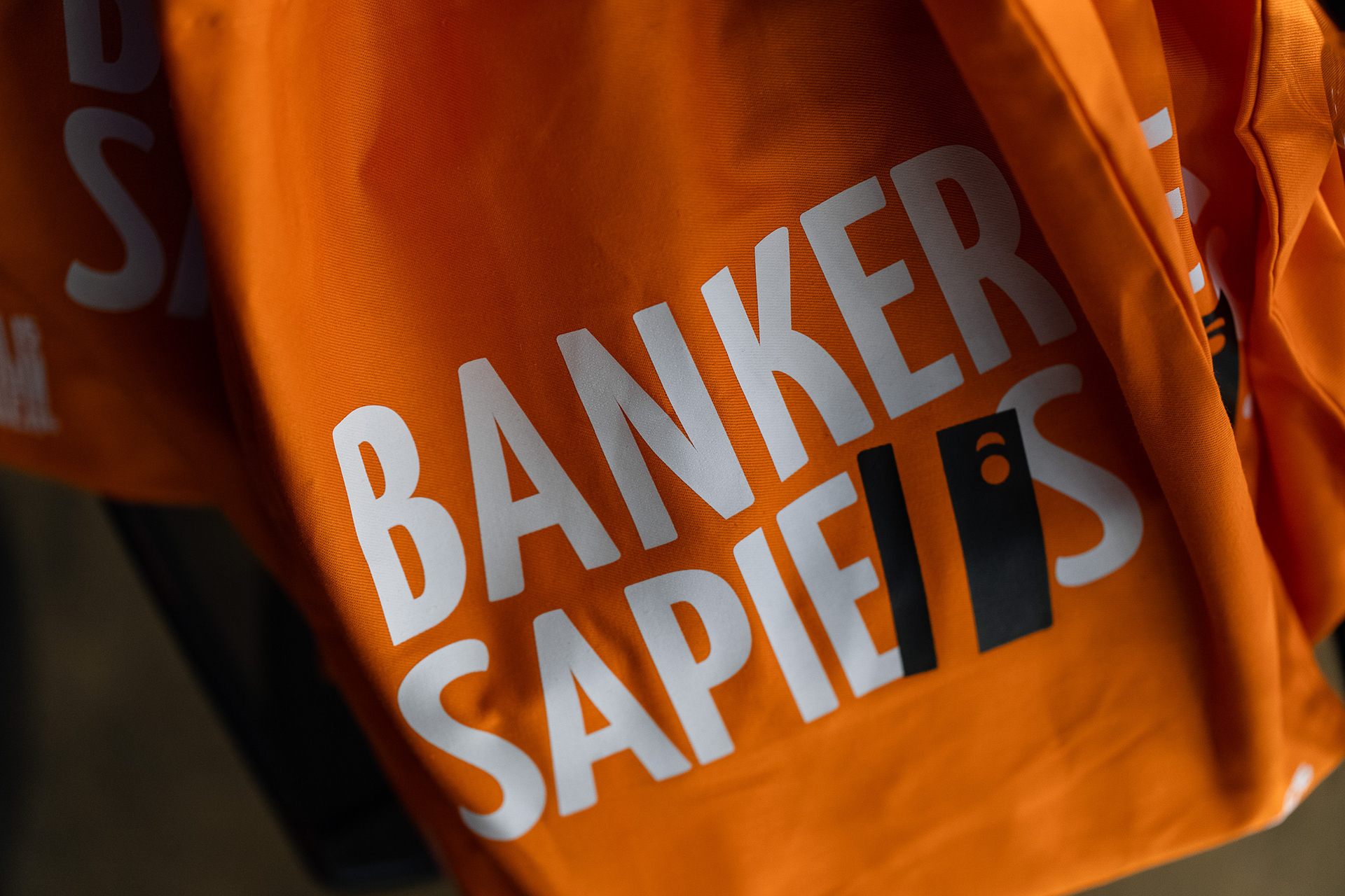
Lot of communication and merch
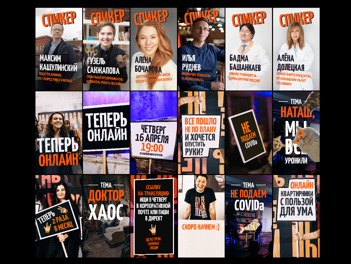
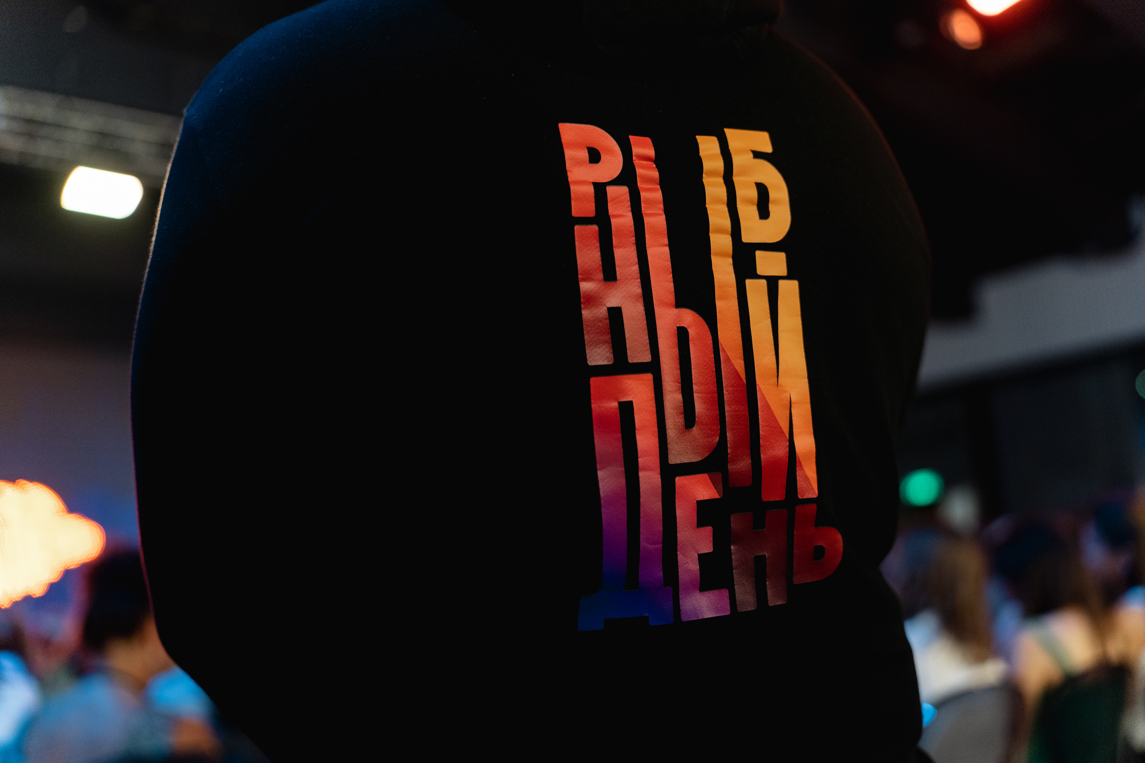
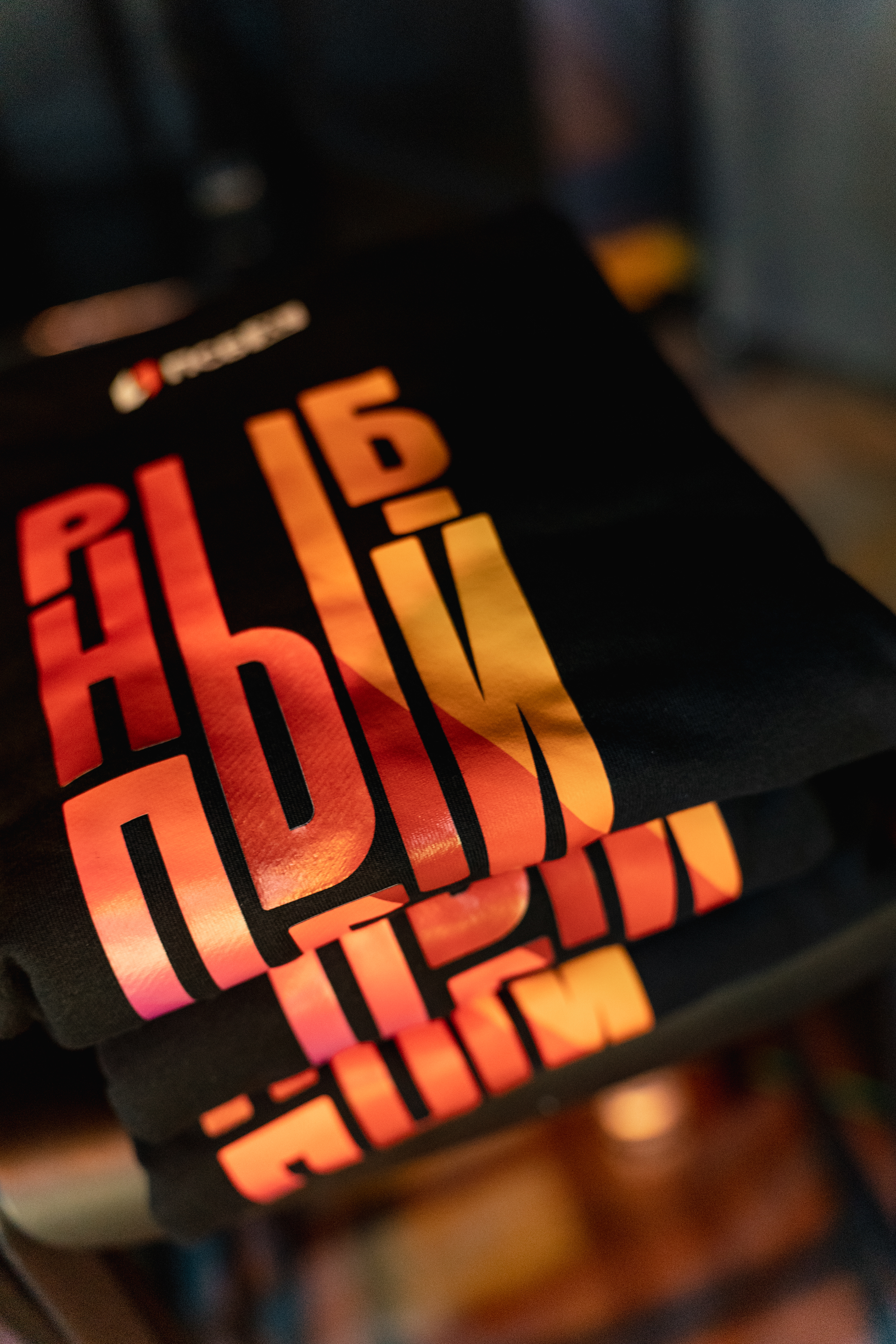

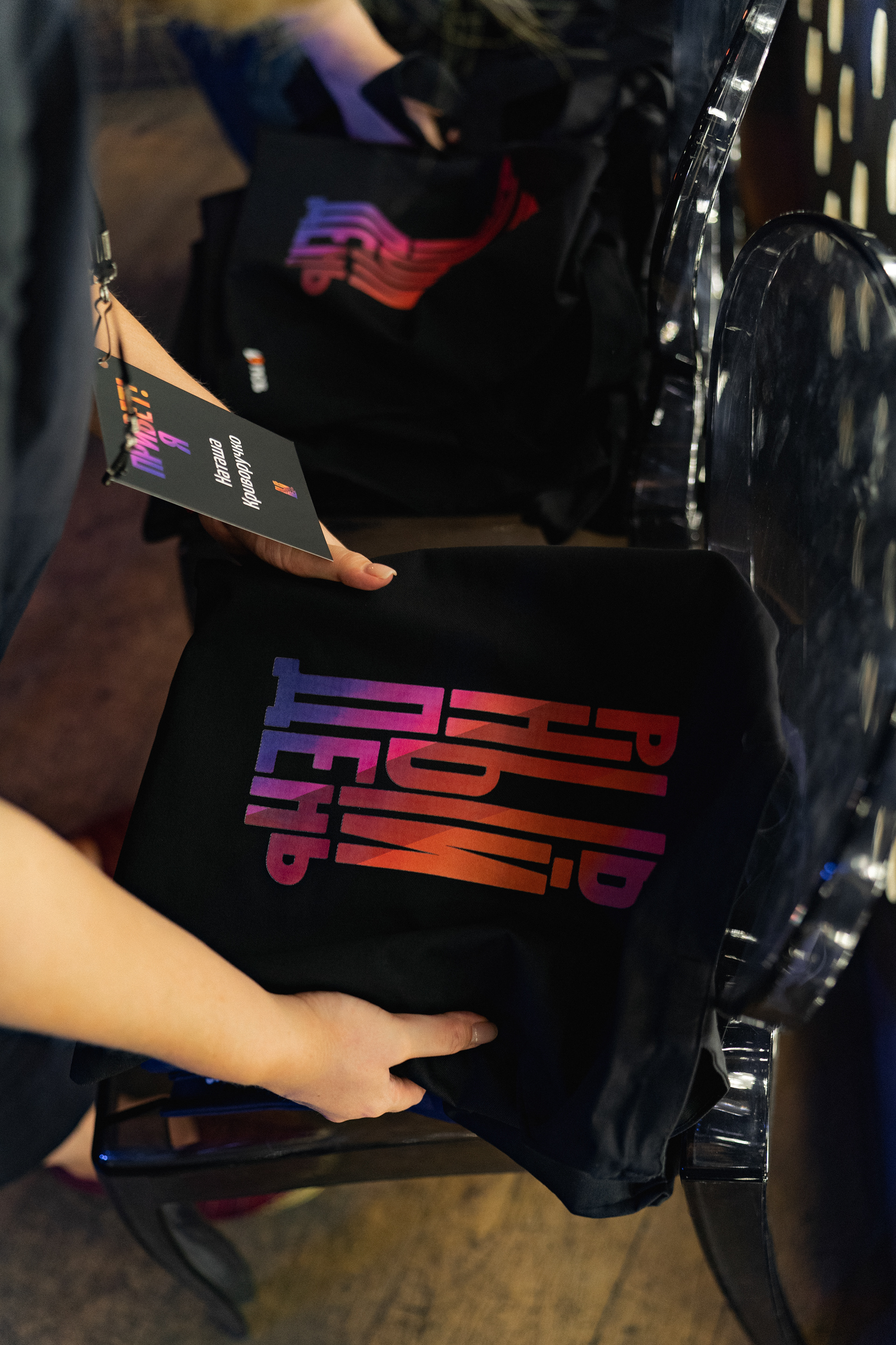

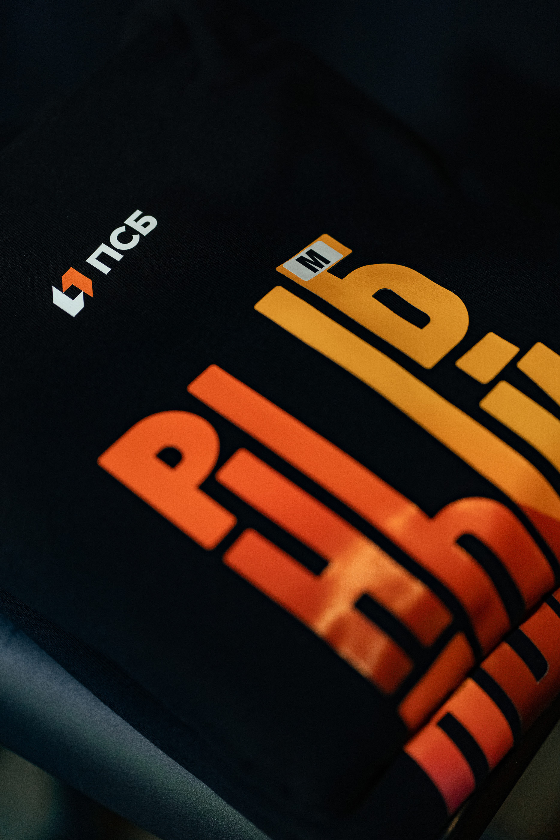
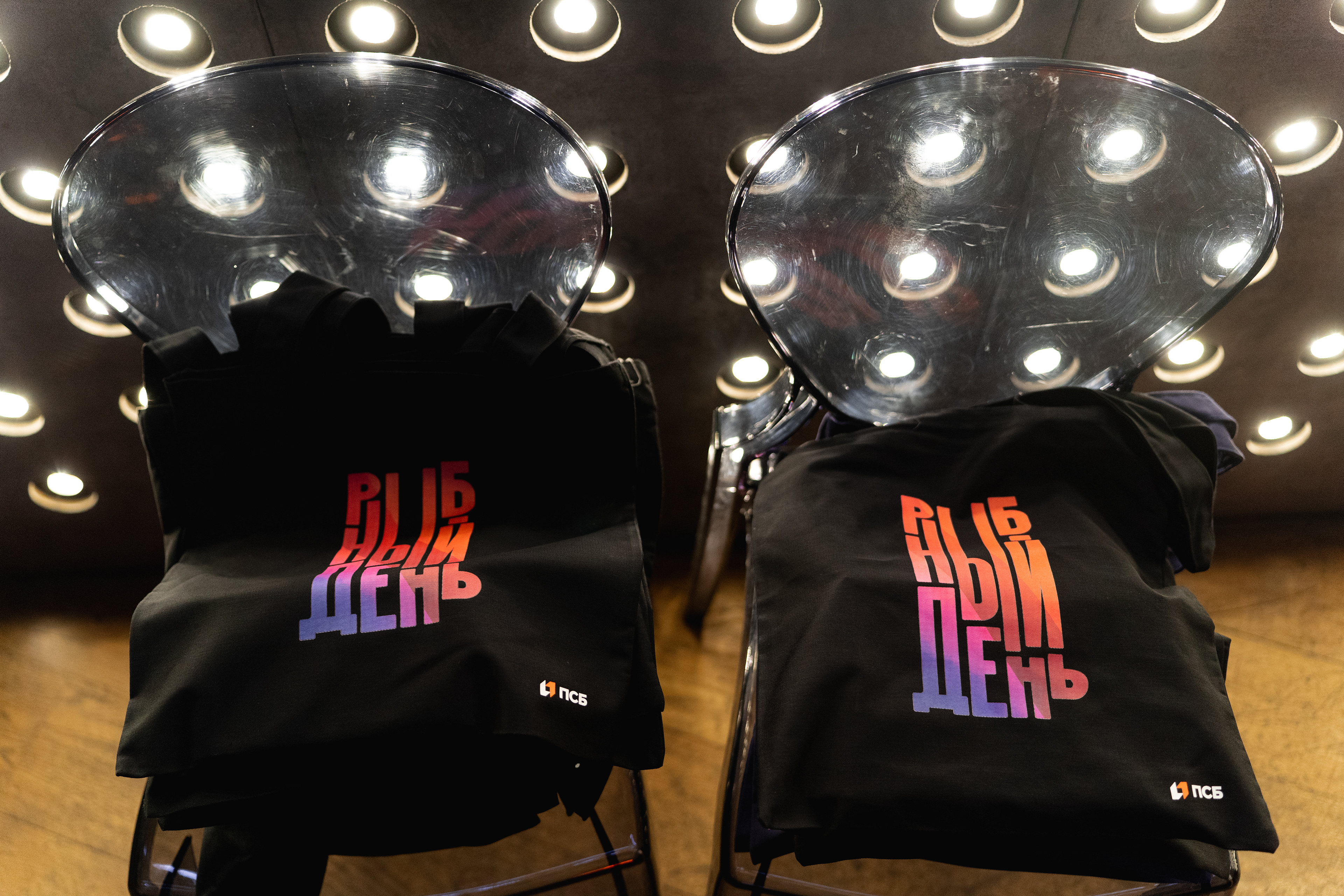
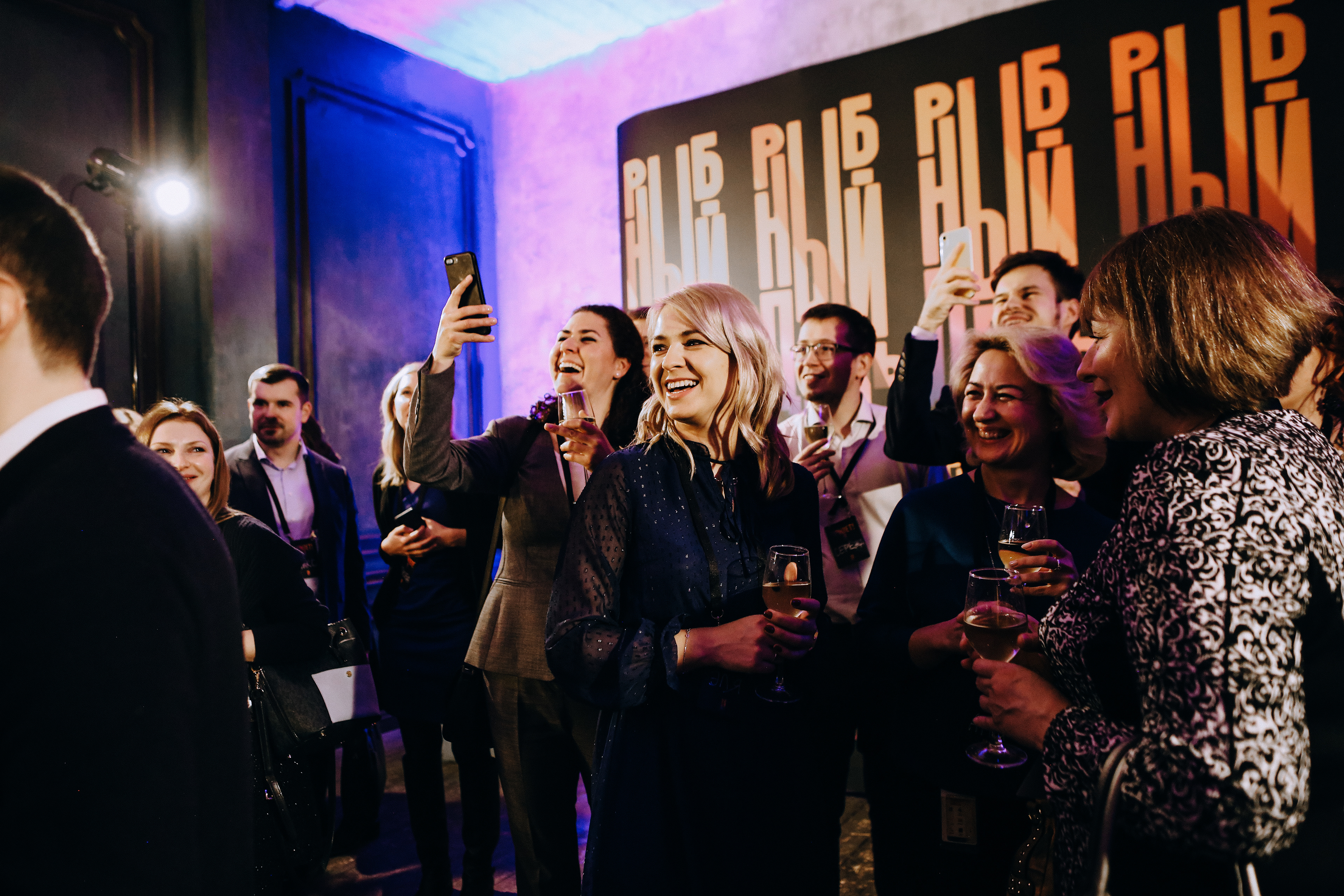
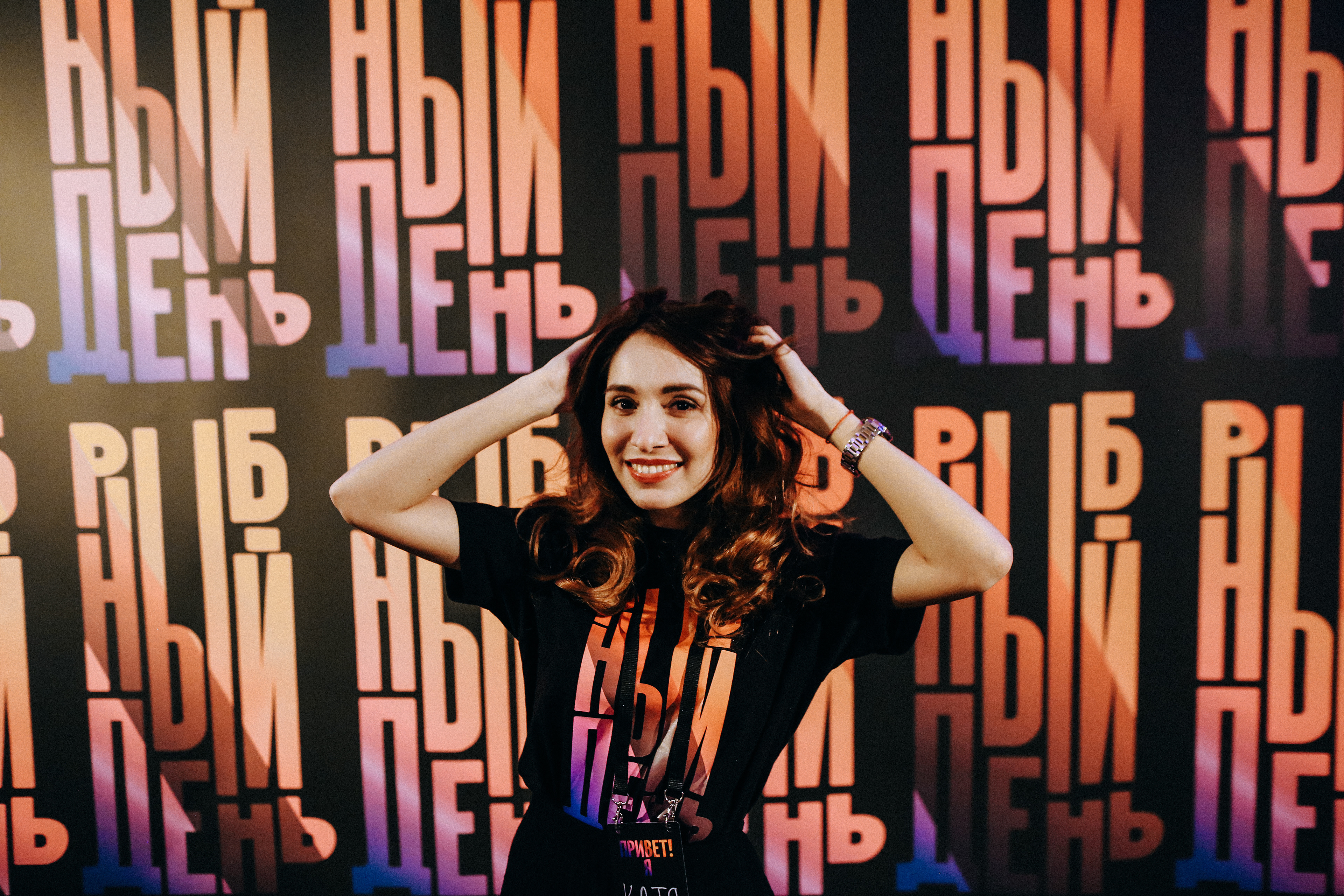
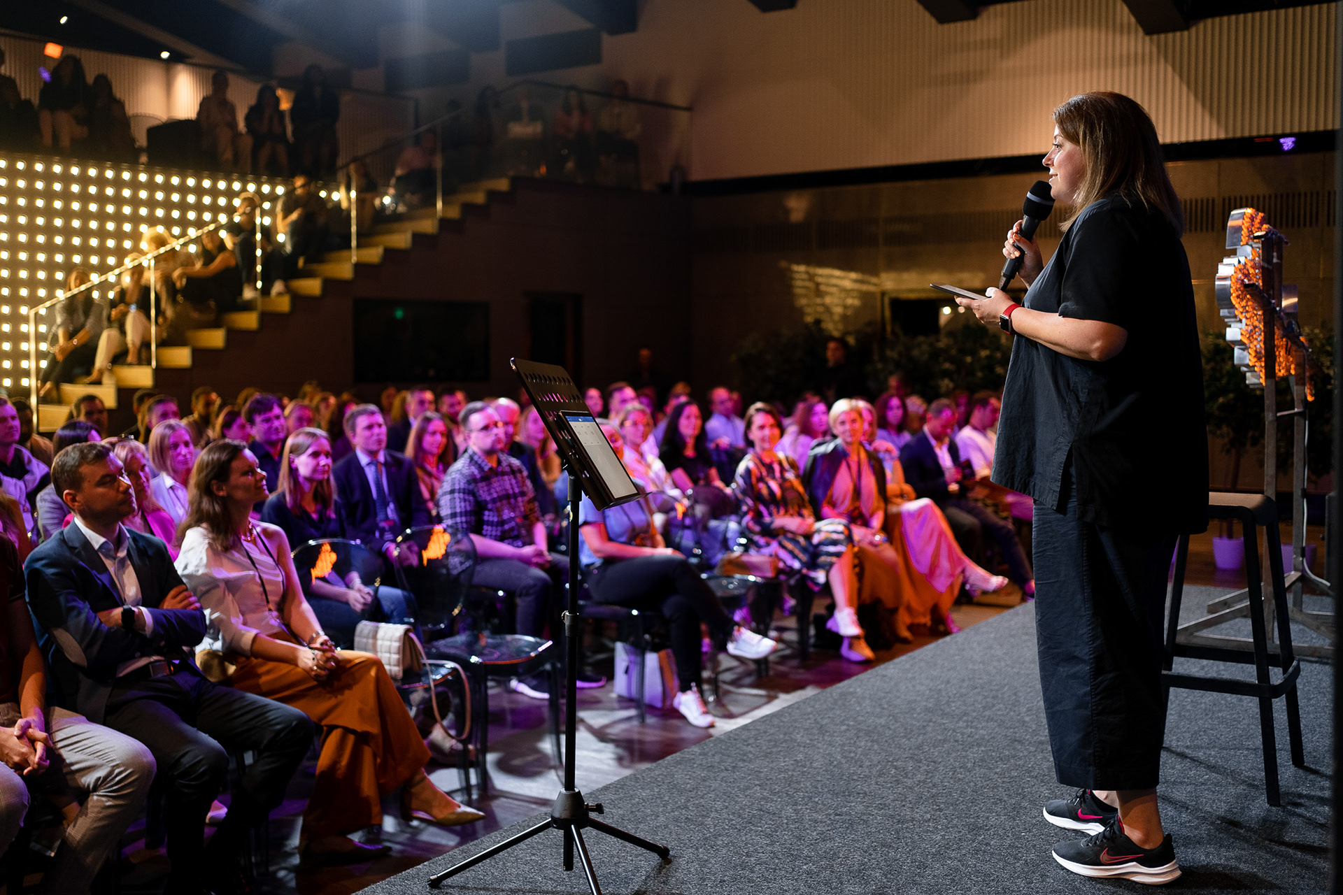
Some photos from 3 years of events